Web3’s coming of age
Part 1: Progressive Onboarding
Henri Stern
|Feb 10, 2023

At Privy, we build simple tools to help you onboard and engage your users in web3. In this series, we’ll share some thoughts on UX in web3.
Today, there is no easy way to get started in web3. In spite of the myriad tools and products built to get users in, most people struggle to interact with public datastores (i.e. blockchains). Installing wallets is difficult for new users, wallet connectors for apps are unreliable and often break, and it’s challenging for many products to show their value until a transaction takes place. We overinvest in tooling without focusing on the experiences they unlock.
Don’t Connect, Activate
There is a word missing from the web3 lexicon. That word is activation.
Onboarding users onto a product is not just about creating an account, it’s about getting them to use the product and see its benefits firsthand.
For some apps, the right onboarding should mean connecting a wallet (and potentially educating new users about wallets and custody), but for others it should start with an email login, prompting a wallet connection later. A user might want to browse items, before choosing to save one or comment on one. The purchase comes later.
Each of these steps requires a different amount of buy-in from the user. And so you should wonder: “does my user need a wallet to make a comment?” If they don’t have one, they’ll have to download an extension and write down a mnemonic. Product fragmentation and learning curves in web3 delay access to core features and lead to churn.
Using the appropriate hooks, you can keep your users moving through your product funnel. By engaging your users early and progressively onboarding them, you continue to prove out product utility. This will make it easier for diverse audiences to discover new flywheels in your app. Put simply, help your user get to your core utility fast!
Wallets galore
But this isn’t to say you should throw the book at your user and give them infinite options to connect to your product.
The first interaction users have with web3 products is increasingly littered with menus of options, often including dozens of wallets to choose from. These options are meant to signal optionality, flexibility, and familiarity for incoming users, but it forces them to compare, filter and choose at the onset. Our users are overwhelmed with tooling and starved of good experiences.
As a builder you must be opinionated about user activation: prioritize the options you offer, and strive to show the best ones. With every option you give, ask yourself “which of my users is this for?”
To be clear, client diversity is important to web3 in deep ways, and enabling users to pick their terms of engagement with your product is key… but it must not come at the expense of your product experience.
Where the space is going
Show users a clear way in, and give them side doors if they already know what they want and what they are doing.
There’s a lot to be excited about in web3. Staple products are making huge strides threading the needle between web3-native UX and friendly, directed flows. We can illustrate some of our points looking at a product we love: OpenSea.
OpenSea has the huge challenge of having to serve both the natives who came on in 2018 and fresh newcomers to the space… A huge undertaking. Accordingly, it’s heartening to see them iterate on UX and adopt new patterns for their users. We’ll call two out two which illustrate some of the tensions web3-builders face.
Wallet onboarding
First, the mixed bag. If you haven’t checked out the connector experience in OpenSea recently, take a look. What an improvement! They’ve recently overhauled their UI here and it is a breath of fresh air. With that said, the choices here are still a bit overwhelming and the link to a wallets tutorial doesn’t do enough to direct me if I don’t already know what I want.
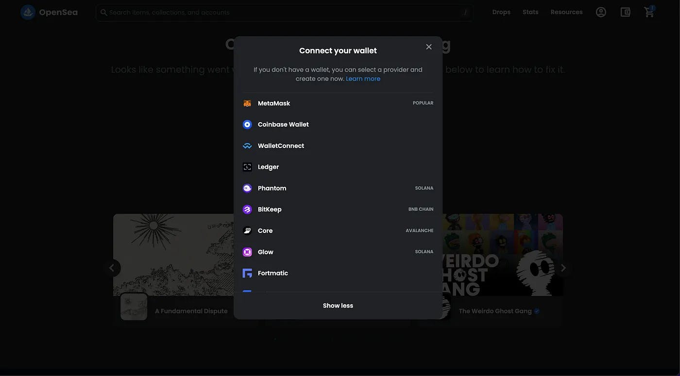
Mind you, this is a nuanced issue given a historical user base that needs a long-tail of wallets, support across various ecosystems, etc. But more direction would go a long way for everyone!
Product selection
Next up, the great. Thanks to the introduction of the Seaport protocol, OpenSea can build more powerful UX. Their use of the shopping cart abstraction here is fantastic. In the below screen, you can see a wonderful mix of familiar and web3-native elements:
The shopping cart and ⚡-shaped “Buy Now” button are intuitive to anyone who’s used Amazon in the past 20 years… which is to say everyone.
“Sweep” and “Send to a different wallet” tastefully point to more advanced usage for power users.
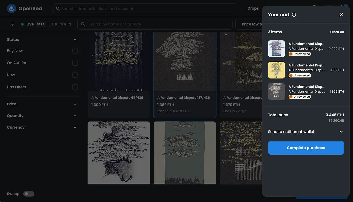
Shout-out to A Fundamental Dispute by @generativeLight and @frolic
The future of the space hinges on our ability to blend familiar interfaces and native concepts. Crypto has given Internet users new ownership superpowers; those will have to be balanced against age-old UX pitfalls, like phishing.
We, for one, are thrilled to see dominant actors thoughtfully iterate on their product experience. The path ahead is long, but the future is bright.
Some lessons
Privy builds simple onboarding to bring more users to web3. Here are a few lessons we’ve learned building in the new web:
Sweat the details: What is the role of wallets in your product, and when should they be connected? Do they allow your user to view something, permit something, or own something?
Progressively onboard: How can you continually engage your users as they explore your product over their lifecycle?
Filter, filter, filter: What is the minimal amount of friction and information needed to empower users to access utility? Be opinionated about the pathways you create. Don’t add — reduce.
If you’re building in the space and want to chat about the experience you are crafting, we’d love to help!


